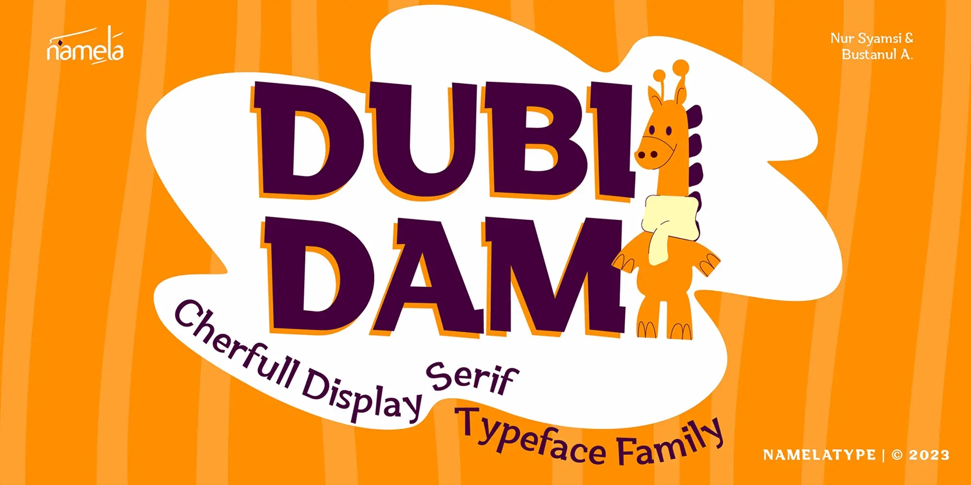
Dubidam is a semi-slab display font that balances the line between fun and firm, crafted to elevate branding and showcase a bold yet approachable persona. Its design consists of semi-slab characters to present stability and rounded shapes to add a friendlier touch compared to regular slab serif fonts.
This mix of sternness and playfulness gives Dubidam an energetic and unique visual display, making the typeface highly attention-grabbing. It helps bring out the friendly and engaging side of a brand while maintaining strong readability and structural clarity, making it suitable for a wide range of modern visual communication needs.
Background and Development
The design of Dubidam was inspired by the idea of combining a joyful display font personality with the stability of a slab serif structure. The goal was to create a versatile typeface capable of supporting different branding directions across products with varying visual identities and audiences.
By blending firmness and softness, the resulting letterforms achieve a visual harmony between whimsy and functionality. Each character feels expressive yet controlled, allowing the typeface to perform effectively in both playful and structured compositions. This balance makes Dubidam adaptable for use in advertising, packaging, editorial layouts, and creative campaigns.
In several experimental applications developed alongside the Namelatype foundri collection, Dubidam demonstrated its flexibility across both expressive and highly readable display settings.
Name Philosophy
The name “Dubidam” carries a rhythmic and musical tone. It sounds playful and expressive while still feeling balanced and structured. This mirrors the personality of the typeface itself: energetic, cheerful, and dynamic without becoming visually chaotic.
Although the font contains strong structural foundations, its rounded construction softens the rigidity often associated with slab serif typography. The name reflects this same balance by sounding lively yet grounded, giving the typeface a memorable and approachable identity.
If this font matches your project, Meila is another recommended Playful typeface to consider.
Design Details and Structure
Dubidam’s design emphasizes harmony between bold self-expression and friendly visual communication. Its semi-slab serif construction creates a stable appearance, while rounded terminals and softened edges contribute warmth and accessibility.
The typeface was intentionally developed to maintain strong readability while still feeling emotionally engaging. This approach allows the font to work effectively in both short-form headlines and larger visual compositions where personality and clarity are equally important.
The balanced stroke construction also helps Dubidam perform consistently across various typography applications, including packaging, posters, social media graphics, and identity systems.
Use Cases: Branding and Logo Design
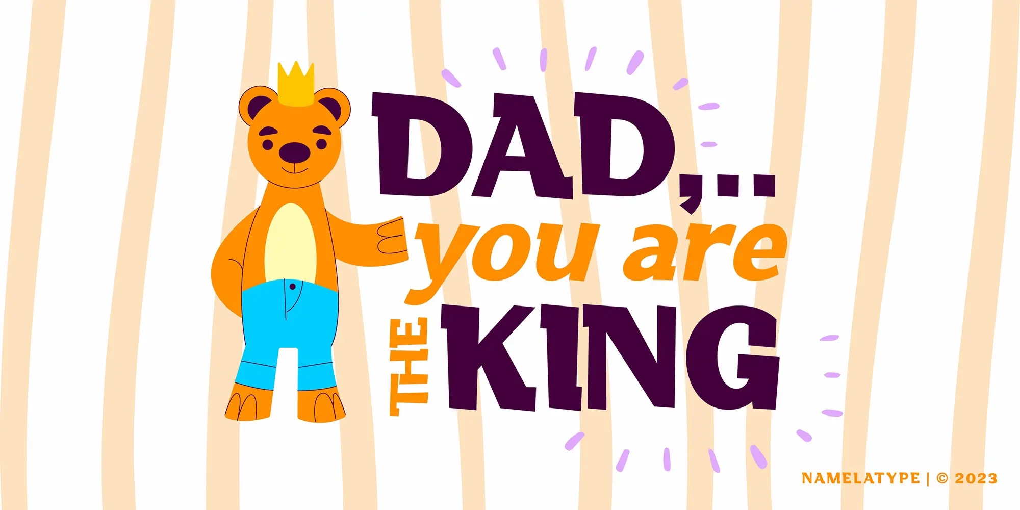
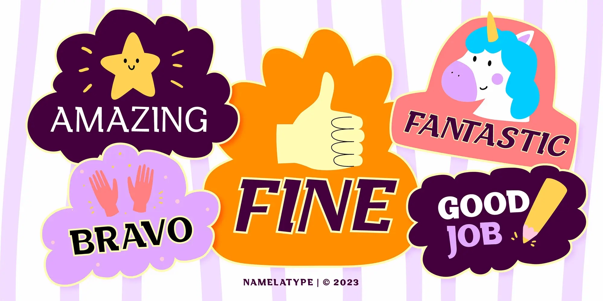
Dubidam was designed for projects that require a cheerful visual tone without sacrificing confidence and structure. Its combination of friendliness and boldness allows it to stand out while remaining highly legible.
The typeface is especially effective for:
- kids’ branding
- logo design
- product packaging
- social media campaigns
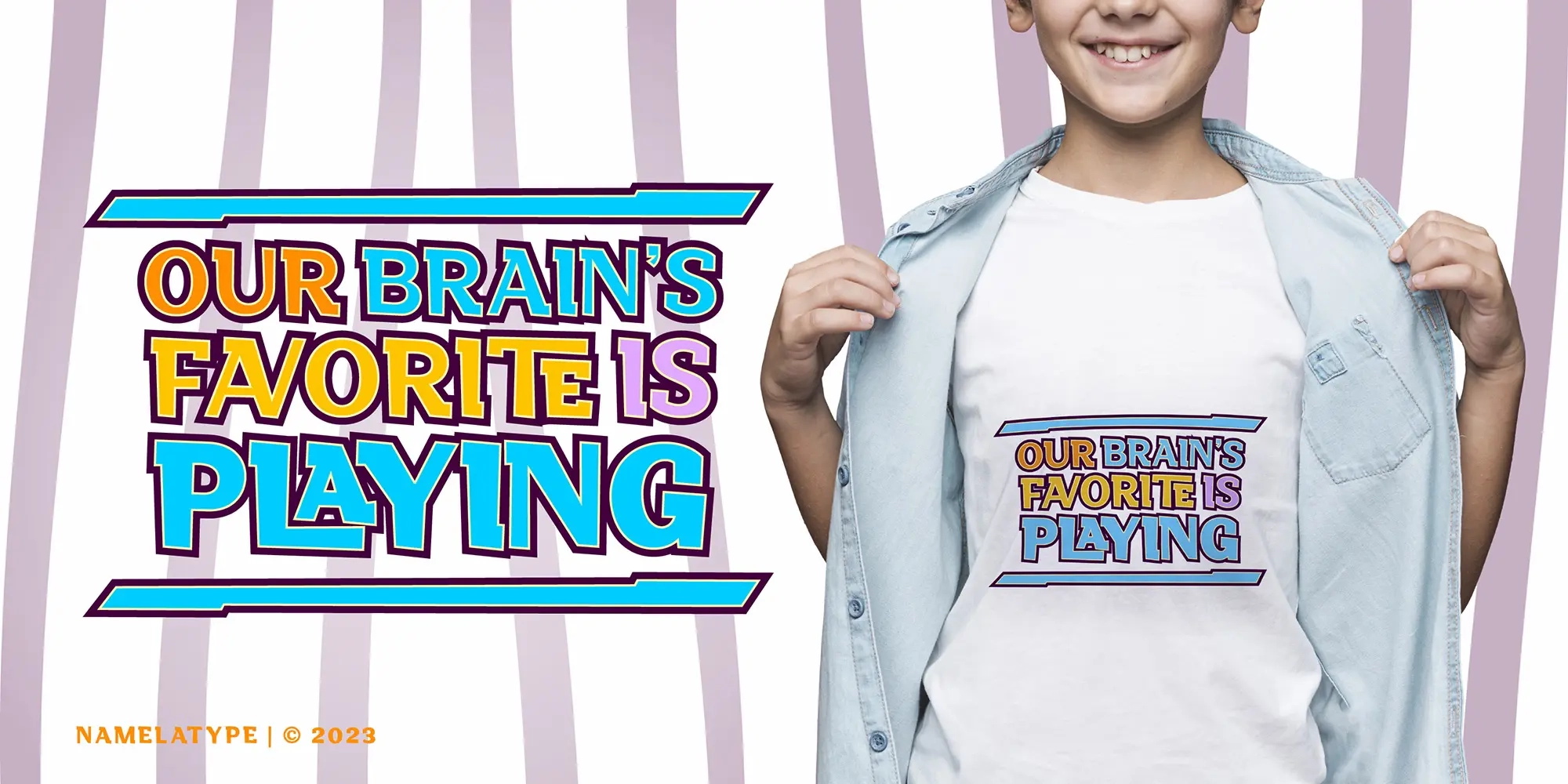
- poster headlines
- quote graphics
- playful editorial layouts
- visual identity systems
Its semi-slab structure gives the font enough authority for professional communication, while its rounded construction adds warmth and accessibility. This makes Dubidam suitable for brands that want to appear expressive, approachable, and memorable.
Explore our recommended Arabic companion, Childos Arabic, for elegant cross-script typography.
Conclusion
Dubidam is a contemporary semi-slab typeface defined by its balance between structural firmness and cheerful expression. Through its rounded shapes, sturdy proportions, and engaging visual rhythm, the font delivers both personality and readability in equal measure.
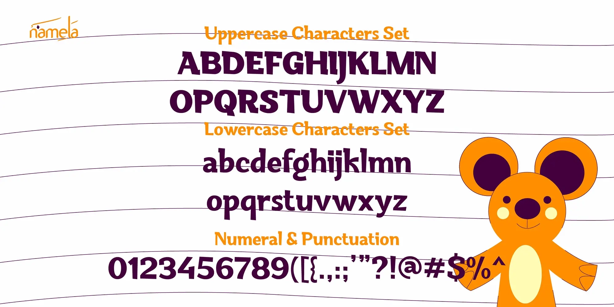
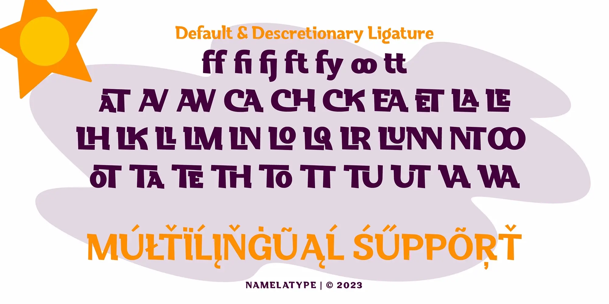
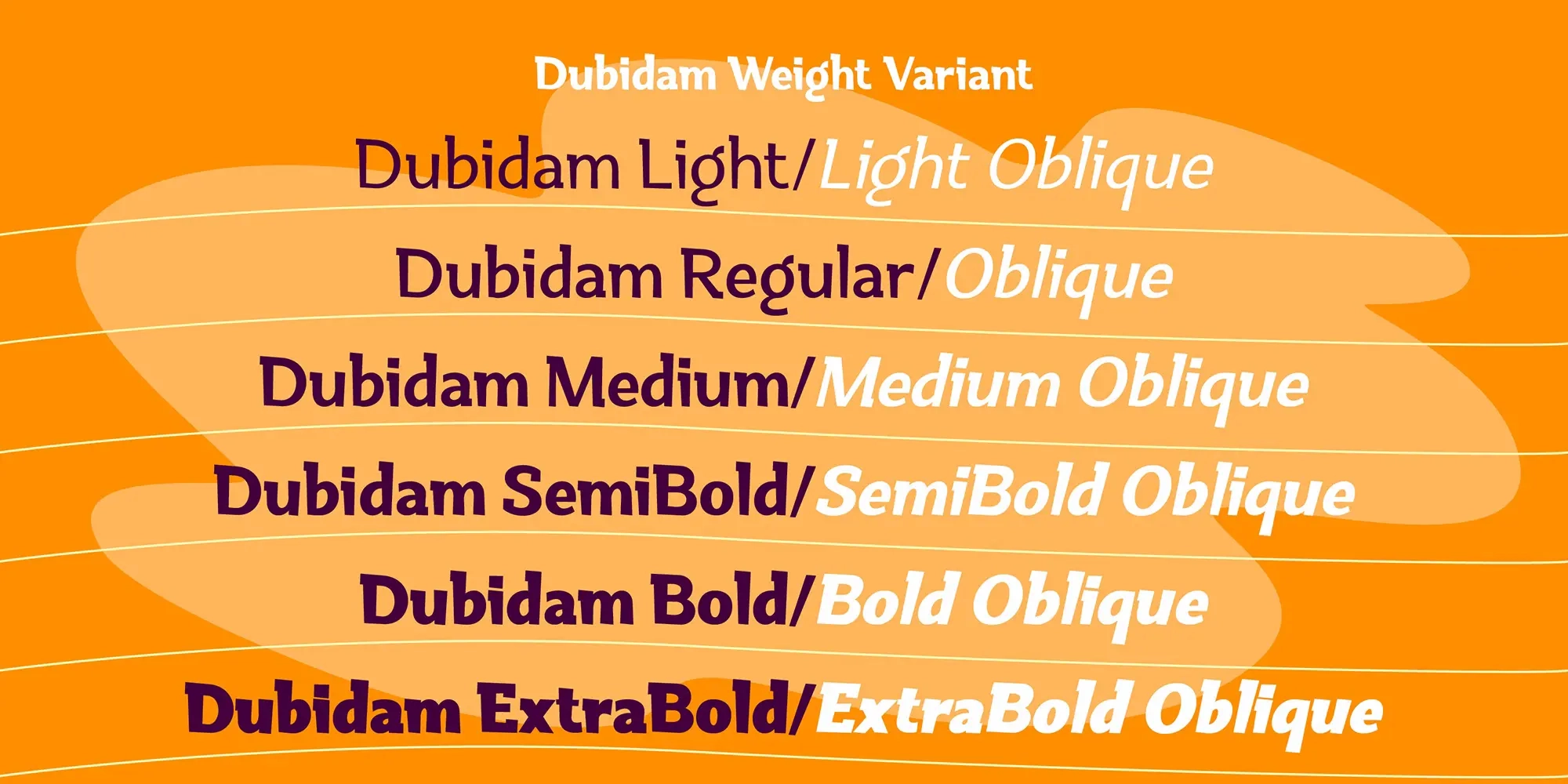
Supported by multiple weights and advanced font features, Dubidam offers flexibility across numerous design contexts. Whether used for children’s branding, packaging, advertising, or bold display compositions, the typeface provides a visually appealing and highly functional solution for modern typography.